Happy the man who dreams his purpose plots his course to achieve that very goal marches to the beat of his own drum and pity one forced to follow roads laid down by parents’ aspirations but I drifted into adulthood with no pressure and no direction and took many turns along the way slowly grew into the man I am Though I am old with wandering
Love life is the companion to work the superficial couplings of youth conducted with more vigour than sense reaching the sunny uplands mid-life settling into a career I thought would last a lifetime, a love to match but people carry pasts within them like hidden rocks in a calm ocean and accidents deflect one’s passage Through hollow lands and hilly lands
To know another is a life’s work the unity of coupledom is illusion, we travel parallel at best, learning the geography of roads built across bogs of trauma always ready to gently subside and mire a person in buried past and paths are hard to find in a slough of despond and she has lost her way I will find out where she has gone
Looking back at the path I followed there is more coherence than I thought skills grown and transferred in work and life and love too, so much surer than in youth and all the scars and breaks accreted are the medals of experience and trying not to look toward the end but focus on the roadside flowers the next generations we began And kiss her lips and take her hands…
Over at dVerse Poets Pub, Björn Rudberg (brudberg) in FormForAll, Meeting the Bar: Critique and Craft, invites us to writa a Glosa, a Spanish poetry form in which four lines borrowed from a poem by another – the cabreza, are expanded upon over 4 ten-line stanzas… I chose lines from WB Yeats, who I have loved since studying him at school, and whose poems still resonate with me today. In 1995, I went to live in Sligo, Ireland, where Yeats is from, and is buried beneath nearby Ben Bulben mountain. I was a signwriter and painted a sign and mural of Yeats and his work, for The Winding Stair bookshop there – you can see me working on it in this news clip…
I confess I am not a great fan of autobiographiesthat begin at the beginning and follow a temporal path up to the present day – not that the person might not have some interesting stories, facts and opinions strung on their necklace, but it just doesn’t appeal as a structure. On the other hand, in my last, extra year at school in Oxford, retaking an A-level and adding a couple more, I was allowed out of school on my recognisance and saw a fascinating Exhibition at the Modern Art Gallery. The Artist had laid out and photographed every single possession of a single person – for example, all the cutlery was laid out in one shot, all the shoes in another. This more thematic approach appeals more and although I am not arranging the objects which I have chosen to tell my story in chronological order, I hope that my writing will be sufficiently interesting to keep your interest Dear Reader, and that on the journey from A to Z, you will assemble an impression of my life and who I am…
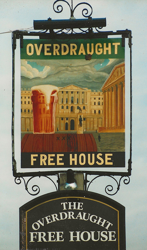
This sign remains one of my favourites from my pre-Ireland signwriting days. It was the first pub sign that I ever got to do because most pubs were tied to breweries who employed their own in-house signwriters. But in the year before I moved to Ireland, the government broke the monopoly of breweries and forced them to sell off some as “Free Houses”. “The Overdraught ” was a pun on the new owner’s means of financing his purchase so I followed suit by showing an overflowing pint of beer in front of the Bank of England! Pictorial pub signs hark back to the days when many people couldn’t read and relied on the pictures…
Signwriting was not a considered choice – the first piece of sign-like lettering I did was to paint my late sister Carol’s,name on a steamer trunk left over from our voyage to Australia in 1968. Carol was mad into all things canal, so I painted a shadow block lettering such as you see on English narrow-boats. Then I asked, on the spur of the moment, whether an antique shop opening just around the corner from me would like a sign – English readers may laugh when I tell them it was called Acorn Antiques (a comedy sketch in Victoria Wood’s iconic comedy show). A wholefood shop in Brixton followed and when I moved to St. Albans to live with Barbara, it became my living as a jobbing signwriter.
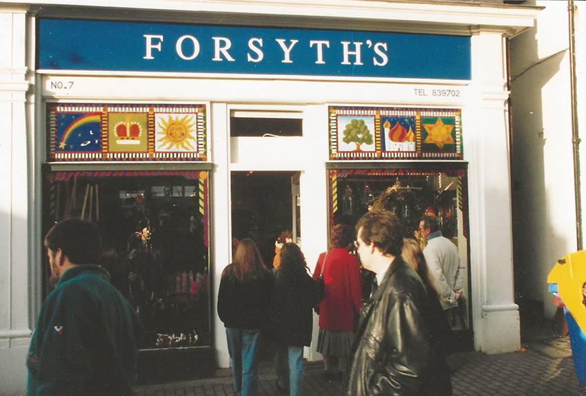
A St. Albans shop, if my memory serves me correctly, where I painted both the fascia board sign, and the window panels…
Signwriters or Signpainters can be separated from ordinary painters because they hold their long-bristled brushes perpendicular to their work. Halfway through their apprenticeships, they would divide into signwriters and poster writers – those indian ink on fluorescent paper, posters, typically seen outside churches back in the day… An old signwriter told me that when he was apprenticed, he spent a year before even touching a paying customer’s work. Each day they would practise writing letters on a gloss board, only to clean them off after the end of day’s inspection – he said they spent a whole month just practising “S’s”. Perhaps I was destined to become a signwriter for my only memory of a unique interaction with my Grandad (the one who was unable to become a teacher after WW1), was that he looked over some lines of “S’s” I was practising and said ” The halves should be equal top and bottom!” to which I replied, challengingly “No! You can have them differently if you want to!”
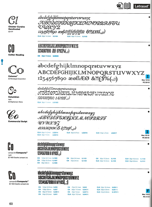
I became a signwriter at a crucial time for the profession, computer-cut vinyl and pespex lettering were on the rise and signwriters had been challenged by the rise too, of the graphic designer. When I worked at the Greater London Council as the office junior in the Graphic design section, if we wanted a fancy headline font, we could use Letraset. For those too young to remember Letraset, you took a sheet of lettering mounted/printed on the back of a sheet of plastic, placed the lettering where you wanted it on your artwork and then burnished the sheet, until, when lifted, the letter was left behind – transferred to the artwork. But here’s the rub – in the days of lead letterpress printing, the minimum spacing of letters was governed by the solid block of lead – you could increase the space (kerning) by inserting spacers but the minimum was a given. Now, with Letraset, and later, graphic programmes which anyone could use on a PC, you could, if you wanted, even overlap letters and Letraset blossomed into a myriad of exotic letters, many of which were a nightmare for signwriters to paint if instructed to by a client who had previously gone to a graphic designer for a “design”. Now signwriters, for the most part, used to have tree basic styles, Serif, Sans-serif and Script – everything else was just the use of different bolding, spacing and arranging of letters in straight lines, diagonal lines of even curved lines. Of course there was the fancy stuff you see at fairgrounds, on canal boats and on high end shops, but for the workaday sign, the options were limited for time and cost reasons, so these new demands on their skill were a nightmare which was only really resolved as computerised sign making took over from hand painting.
A page from a late Letraset Catalogue, 1995/96, far after the heyday in the 70’s when I started in graphic design but illustrating the diverse styles which signwriters wer now, routinely expected to use.
So signwriting meant drawing the sign out on a fullsize piece of paper, poincing (with a toothed wheel similar to that used by pattern-cutters in tailoring , but much finer) taping the design to the painted board (tricky on a shop fascia on a windy day) and then rubbing a bag (old sock) full of powder across the pounced letters so that when the paper was removed, the outline of the letters was left in faint dotted lines of powder. As yo used your brushes to paint the letters, the powder would disappear into the paint or be able to wiped off when the paint was dry. That same old signwriter said the only real difference in practice from his early days, was the use of masking tape – not the whit tape used by painters and decorators, but red, transparent “Litho Tape” a crossover from the print industry – it could make neat edges top and bottom or even follow a curved line. Previous to tape, signwriters had to rely on the squareness of their “Chisel” brushes to get neat corners. The oter, pointed type brush used by signwriters is known as a pencil.
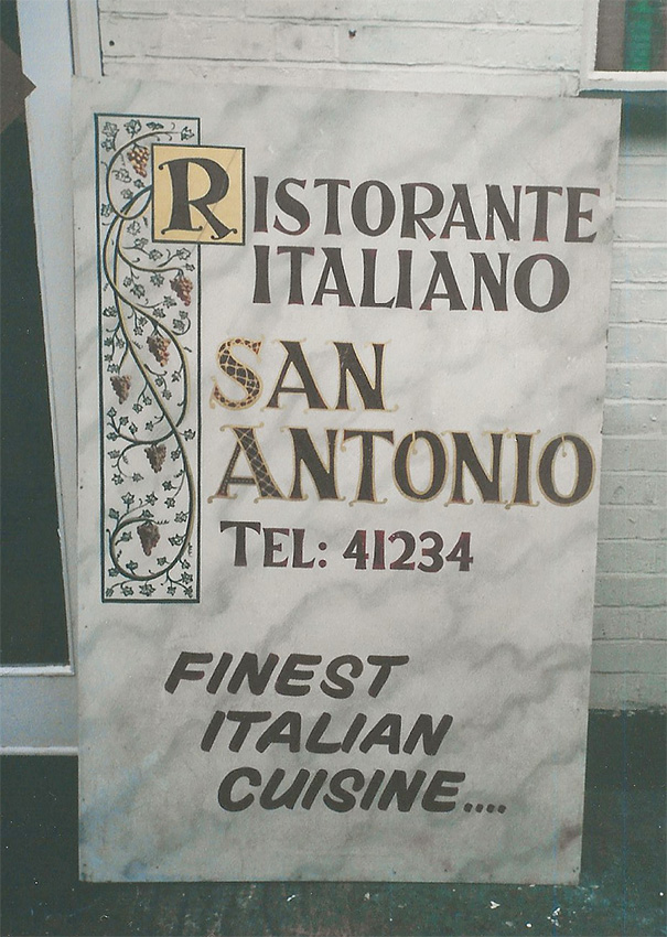
As well as shop fascia boards, pavement A-signboards are a staple for the jobbing signwriter. In this one, I had marbled the background before painting the lettering…
In the 80’s, there was a resurgence of “special paint effects” – woodgraining, marbling, sponging or as above, rag-rolling. These finishes had last come to prominence in the 1930’s when the advent of plywood panels in doors made it necessary to paint rather than varnish doors. For me, this meant a mission creep from signwriting to specialist decorating as in this Chinese Restaurant.
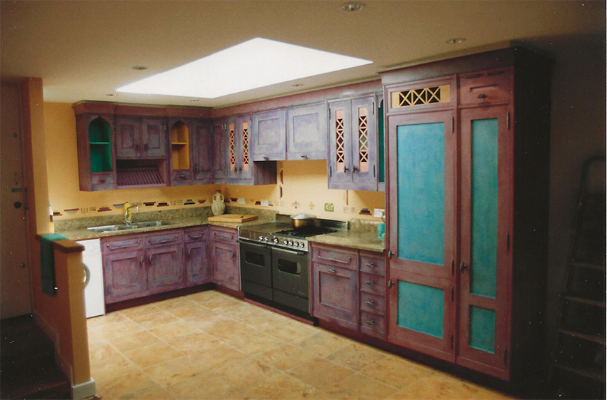
Smallbones, a famous fitted kitchen company in the ’80s, left it up to the clients to find a painter, and I enjoyed painting this one in a modernist listed building – a 1960’s house in North London (a detail, including stencilling, is shown below).
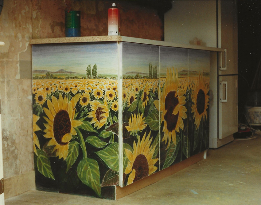
A kitchen I constructed from scratch – what can I say my daughter loved sunflowers…
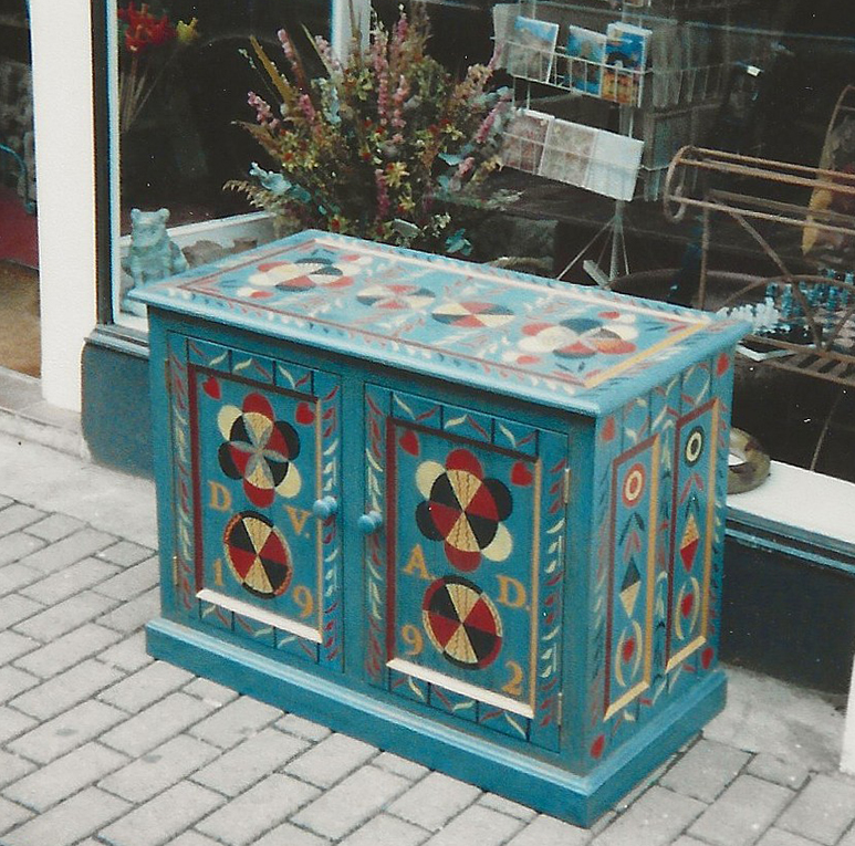
A stencilled piece of furniture intended to be the start of a collection bur which didn’t get realised and which we still have in our home today. Guess the date I painted this…
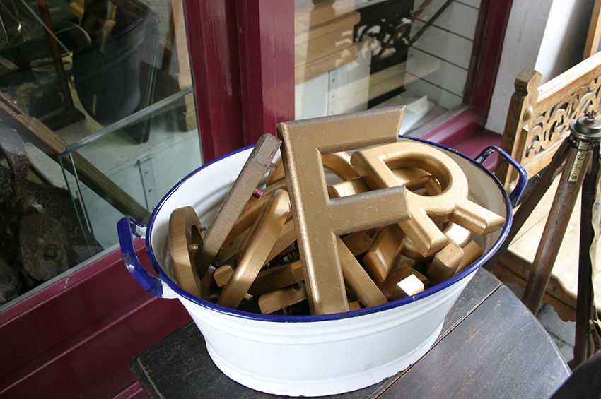
Like Letterpress wooden type before it, the fate of old 3-D sign lettering was to end up in antique shops…
Squidgy Things
Eventually, I fell in with a lady called Anna Ryder-Richardson, a nursery, soft-furnishing maker who had a shop called Squidgy Things and for a year, I made furniture to compliment her soft-furnishings. Unfortumately, developing a business such as this requires finance and my own finances suffered and it eventually became part of the reason I ended up moving to Ireland, where I returned to amore steady diet of signwriting. I fond myself the only signwriter in Sligo who could work with gold-leaf which gave me an immediate advantage.
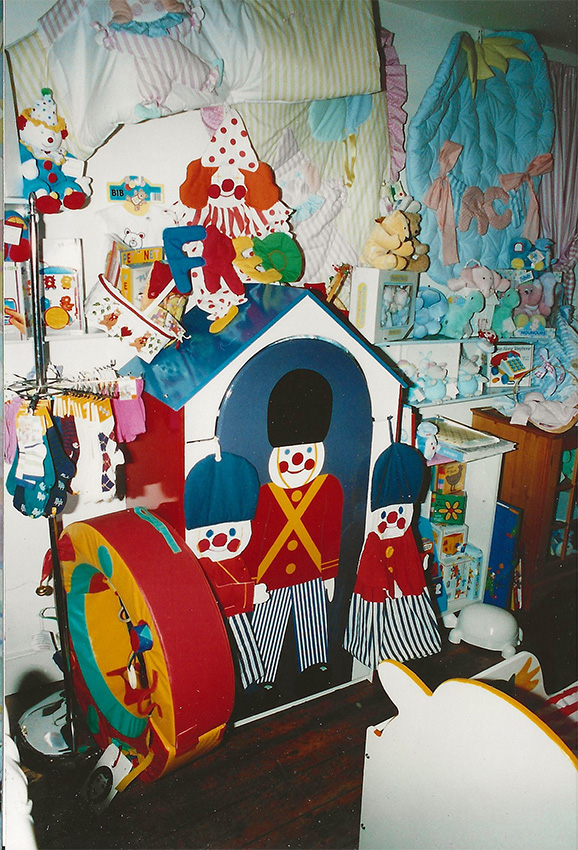
A Postman Pat children’s bed and below, a sentry bow wardrobe…
During the time I worked with Squidgy Things, we received an unexpected boost due to the scandalous revelation of intimate phone calls between Princess Diana and her lover which became known as the “Squidgy Tapes” – you couldn’t make it up… Shortly after I moved to Ireland, Anna Ryder-Richardson herself, made a move into TV where she had a programme known as “House Invaders” in which she did house makeovers often using paints and fabrics that the owners already possessed…
P.S. I was originally going to include Spreadsheets in this post but I mentioned them elsewhere, so although I removed it from the tentative title, WordPress has incorporated it into the link – apologies to any spreadsheet fans…