If you have seen my Theme Reveal for the A2Z Challenge 2022, then you will know that I am writing about becoming Vegetarian gradually as a response to the crisis in food supply chains sparked by the pandemic and made worse by the WAR in Ukraine. As well, I am keeping to the theme I originally planned of food which can be eaten in its own right as well as becoming an ingredient in other dishes…

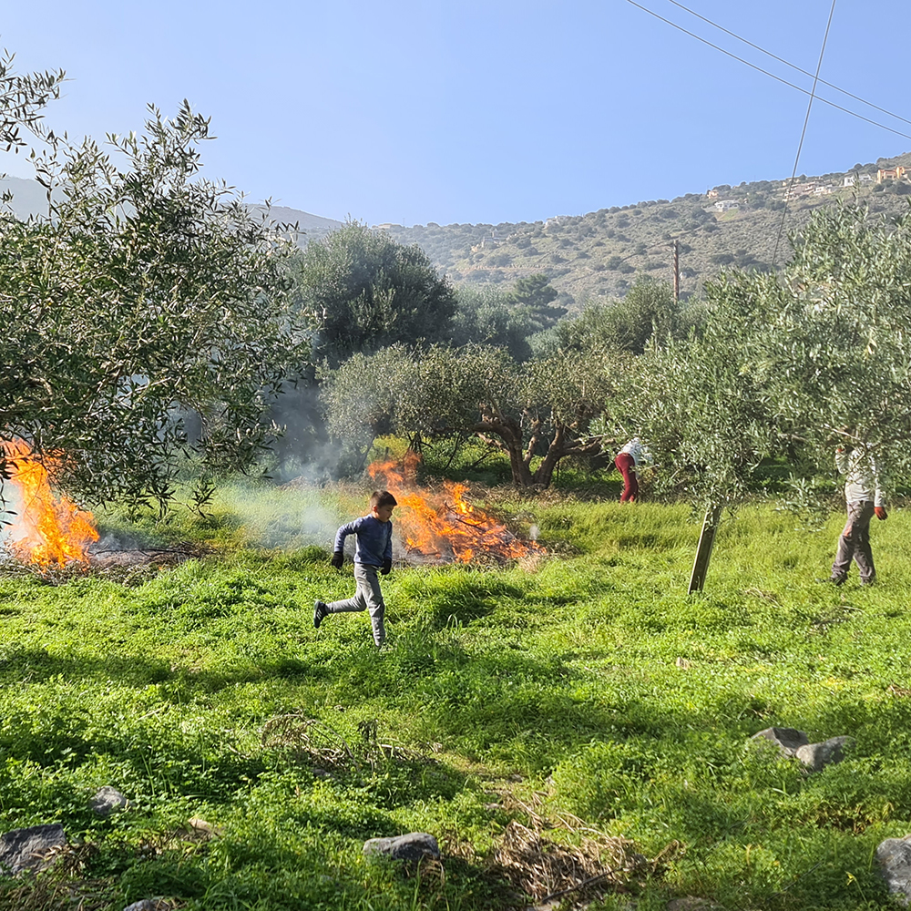
With so many foods in our globalised world, we may never see them growing in their native habitat, but back in the winter of 2020, when my partner and I were lucky enough to lockdown in Crete for six months, I was able to take these pictures, firstly of the olives in fruit and then, following the harvest, the next year’s flowers – beautiful, tiny flowers. Cretan olives are small and although they can be eaten, they are mostly used for olive oil production and little factories all over the island grind into life for their short but frantic season of activity. Following the harvest, growers must prune their trees to keep them at a manageable height and shape for harvesting which is done by placing nets all over the ground below the trees and then using a sort of mechanical beater at the end of a large pole to knock the olives to the ground. So first the island sounds like it is being attacked by giant bees and then later it is shrouded in smoke from the many bonfires disposing of the prunings (see below). There is lot of waste heat generated here but the pits from the pressed olives are dried and do become fuel – the boiler of a laundry serving all the hotels in Elounda, where we were staying, was powered by olive pits!
I realised that year, that what I had always heard, that olives have to be brined in order to remove the bitterness from them and make them palatable, is not the whole story. If you read my entry for K, where I discuss lactic acid pickling, you can see that the olives must be considered as being pickled and that the flavour changes are more complex than simply soaking the bitterness away. There is a variety and style of green olive that I used to get from a Cypriot shop in Brixton, London, where the brining is very light and the olives have been cracked to allow the brine to penetrate better – they then have some olive oil, lemon slices and coriander seeds added – they are definitely more bitter than most olives but they grew on me…
Olive Oil is credited with increasing the longevity of Mediterranean peoples, they use it instead of butter so for example, you sit down at a restaurant and you are immediately brought a small dish of olive oil and some bread to dip into the oil and eat. This will be extra virgin (first pressing) olive oil which has the greatest benefits as well as the best taste. Industry has been quick to jump on the benefit and produce margarine type spreads made from olive oil, but in the same way that the benefits of olive oil are destroyed by heat (so it is no good frying with it if you want it’s health benefits), I very much doubt that the many processes necessary to create spread, preserve the benefits either – take the wholefood (minimal processing) approach and stick to dipping your bread or pouring neat over a salad.
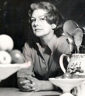
Olives can obviously be eaten on their own but are added to salads and stews but as an ingredient, a classic dish is Tapenade, and once more, Elizabeth David is the person responsible for introducing this to the British in 1950, and once they were able to get the ingredients, following the end of rationing, it provided an easy to achieve but sophisticated dish. The name comes from tapeno, the Provencal word for Capers and although it features olives as an ingredient, this is principally a caper dish. This recipe was adapted from “Mediterranean Cooking,” by Paula Wolfert (HarperPerennial, 1994) and appears here, and Wolfert in turn, based it on Elizabeth David’s recipe…
TAPENADE
– Pit a cup of wrinkled black olives (ready pitted olives do not have the same amount of taste and it’s easy enough to be worth doing yourself)
– 4 tablespoons capers
– 2 tablespoons lemon juice
– 1 teaspoon Dijon mustard
– Freshly ground black pepper
– tablespoons cognac or dark rum
– 1 cup olive oil
1. Soak the olives, anchovies and capers to remove excess salt. Rinse and pat dry.
2. Chop as finely as you can (do not be tempted to use a blender) olives, anchovies, capers. Place in a mixer and add the lemon juice, mustard, pepper to taste and cognac. Mix until pasty.
3. With the motor running, drizzle in the olive oil in a steady stream to obtain a smooth, thick sauce. Transfer to a bowl; let stand for at least an hour before serving to allow flavours to mingle.
Variations: To mellow the bold, salty flavor of this tapenade, mix in about a tablespoon of tomato paste and a pinch of sugar, or a tablespoon or two of crumbled canned tuna. Or bake a whole eggplant at 350 degrees for about 30 minutes, until it is black, blistery and collapsing. Peel under running water, and squeeze out any bitter juices. Place in a bowl, preferably wooden, and pound until well-mashed. Then gradually whisk in the entire cup of tapenade.
Per (1-tablespoon) serving: 53 calories; 5g fat (85 percent calories from fat); 0.5g saturated fat; 3mg cholesterol; 1g protein; 1g carbohydrate; no sugar; no fiber; 245mg sodium; 9mg calcium; 23mg potassium.
And so to overeating…
The “miracle” of first world agri-industry, with it’s chemicals to fertilise, protect from pests and disease, and even genetic engineering, implemented on an industrial scale by machines so large, that many small farmers no longer do the work, but bring in contractors to plough, spray and harvest crops, has made food production more productive and so more profitable – but at what cost? The food may be cheaper, but damage to the environment and bio-diversity and to the quality of the food, raises questions of whether it was worth it – and that’s just the crops. I have already described the cost in terms of land use, of raising meat and to that you can add issues of quality, in the light of the use of anti-biotics and growth hormones being passed up the food chain – to us! But it’s the cheapness that leads to the problem of overeating. In America, where agri-business reigns supreme, visitors to that country are staggered – literally – at the portion sizes in restaurants and equally, by the number of obese people – most Americans are not the svelte people we see in Hollywood offerings…. And the rest of us first worlders are not far behind. The combination of fat and sugar is particularly bad for people on low incomes. Take this trick of the food industry, sugar, salt and acidity, are all flavour enhancers which means that if you are making a tin of baked beans say, you can get away with a tiny amount of tomato in the sauce (saving money), as long as you use a well balanced mix of the flavour enhancers mentioned above. Too much salt is bad for your blood pressure but sugar is the killer, too often hidden in products such as baked beans and in staggering amounts in fizzy drinks, unless they are sugar free – in which case they are replaced, often, with addictive, probably harmful in the long run – Aspatrtame. For years, the sugar industry put the blame for obesity on fat, but we need “good” fats and we certainly don’t need lots of sugar.
Of course, exercise is good in combination with reducing your portion sizes just as much as fat and sugar combined are the very devil! At the end of the day though, reducing portion size and watching the calories (especially from sugar), are the most important steps, the more the weight comes off, the easier it becomes to exercise and then you have a positive feedback loop…


